AESTHEM WEBSITE

Project Background
My Roles
User Research
UI Design
Prototyping
Wire framing
Design System
Tools
Figma
Photoshop
Illustrator
My Roles
User Research
UI Design
Prototyping
Wire framing
Design System
Tools
Figma
Photoshop
Illustrator
Midjourney
Overview
Composition of selected UX/UI design processes and e-commerce website mockups for my brand, Aesthem. It showcases the envisioned design for the brand’s launch.
Overview
I built Aesthem from the ground up - a luxury e-commerce brand that offers beautiful art for refined interiors. From brand identity to conversion strategy, every touchpoint was designed to feel intentional and elevated.
PROBLEM AND GOAL STATEMENTS
Problem: Design-conscious consumers and trade professionals had no clear destination for soulful, high-end art. Especially one that had intentional UX and good conversion strategy.
Problem: Design-conscious consumers and trade professionals had no clear destination for soulful, high-end art. Especially one that had intentional UX good conversion strategy.
I feel stuck. The current collection doesn't reflect my best work and brand doesn't feel high-end enough to raise my product price.
I feel stuck. The current collection doesn't reflect my best work and brand doesn't feel high-end enough to raise my product price.
Goal: Create an intentional, conversion-focused online experience offering beautiful art, that feels like a gallery, functions like a store, and serves both consumers and trade professionals at a premium price.
Goal: Create an intentional, conversion-focused online experience that feels like a gallery, functions like a store, and serves both consumers and trade professionals.
3 CONVERSION STRATEGIES
3 CONVERSION STRATEGIES
1. Hero Section Redesign
1. Hero Section Redesign
A hero section that builds trust in seconds, anchors the brand’s positioning, and reduces friction to conversion.
A hero section that builds trust in seconds, anchors the brand’s positioning, and reduces friction to conversion.
Before
Stock visuals, unclear positioning, no hook.
After
Refined visual direction, lifestyle photography,
poetic copy, and friction reducing layout that
anchors brand value in seconds.
2. High Converting CTA Copy
2. High Converting CTA Copy
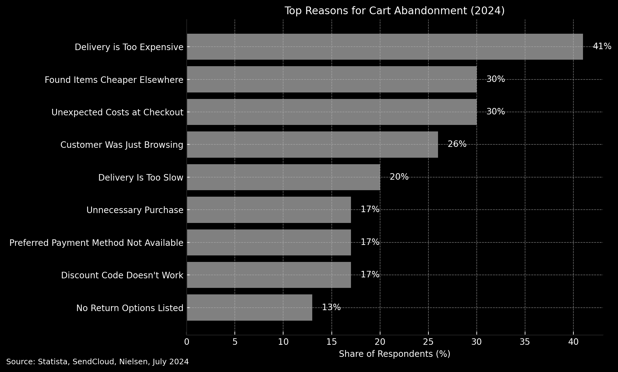
According to a 2024 study, 41% of cart abandonments happen because delivery feels too expensive.
According to a 2024 study, 41% of cart abandonments happen because delivery feels too expensive.
Before
Vague image, generic copy, no clear product or audience signal.
Visitors had no reason to trust, stay, or convert.
After
Refined visual direction featuring lifestyle photography, real product
context, and intentional messaging. Headline and subcopy are crafted
to resonate with the ideal customer.
Before
Generic product thumbnails, unclear hierarchy, and copy
with no emotional and converting pull.
After
Elevated styling, thoughtful artwork, and narrative-rich copy
reframes art as a collectible item. The layout and language speak directly
to a design-conscious customer seeking meaning, not just material.
Multiple payment methods available
2 free shipping options → 1 auto-selected free shipping

So, I offered free shipping + created a high converting CTA.
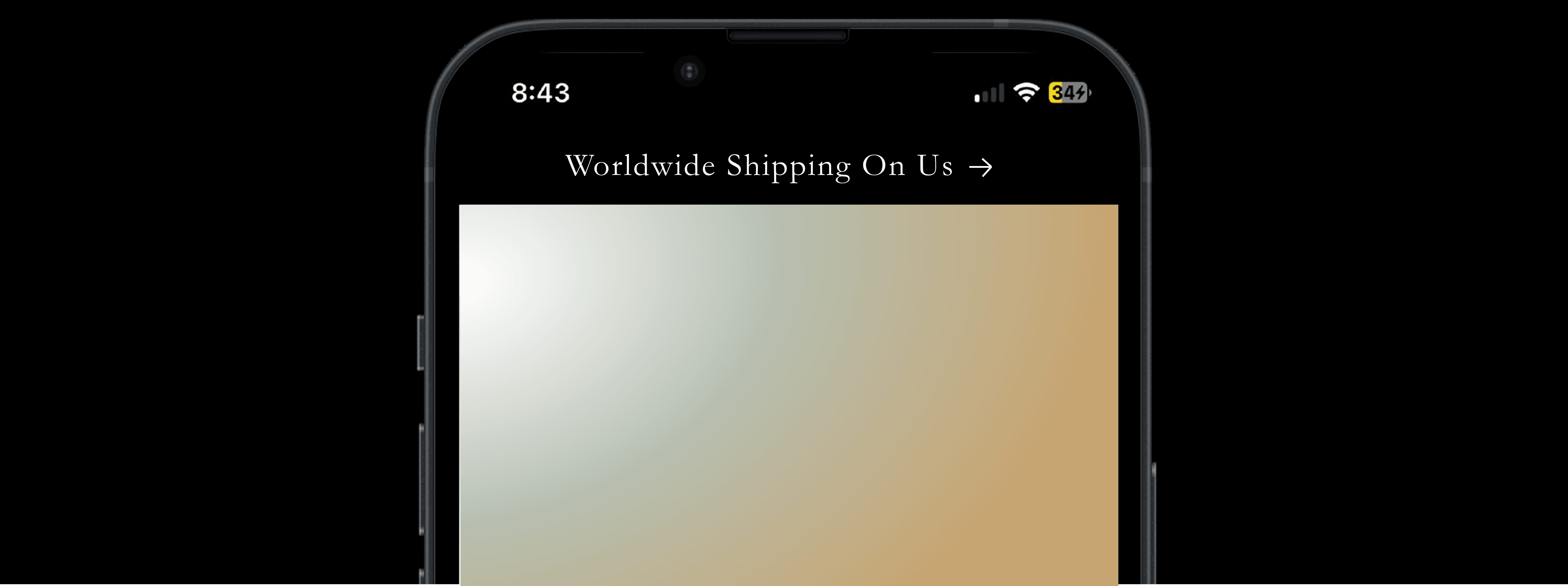
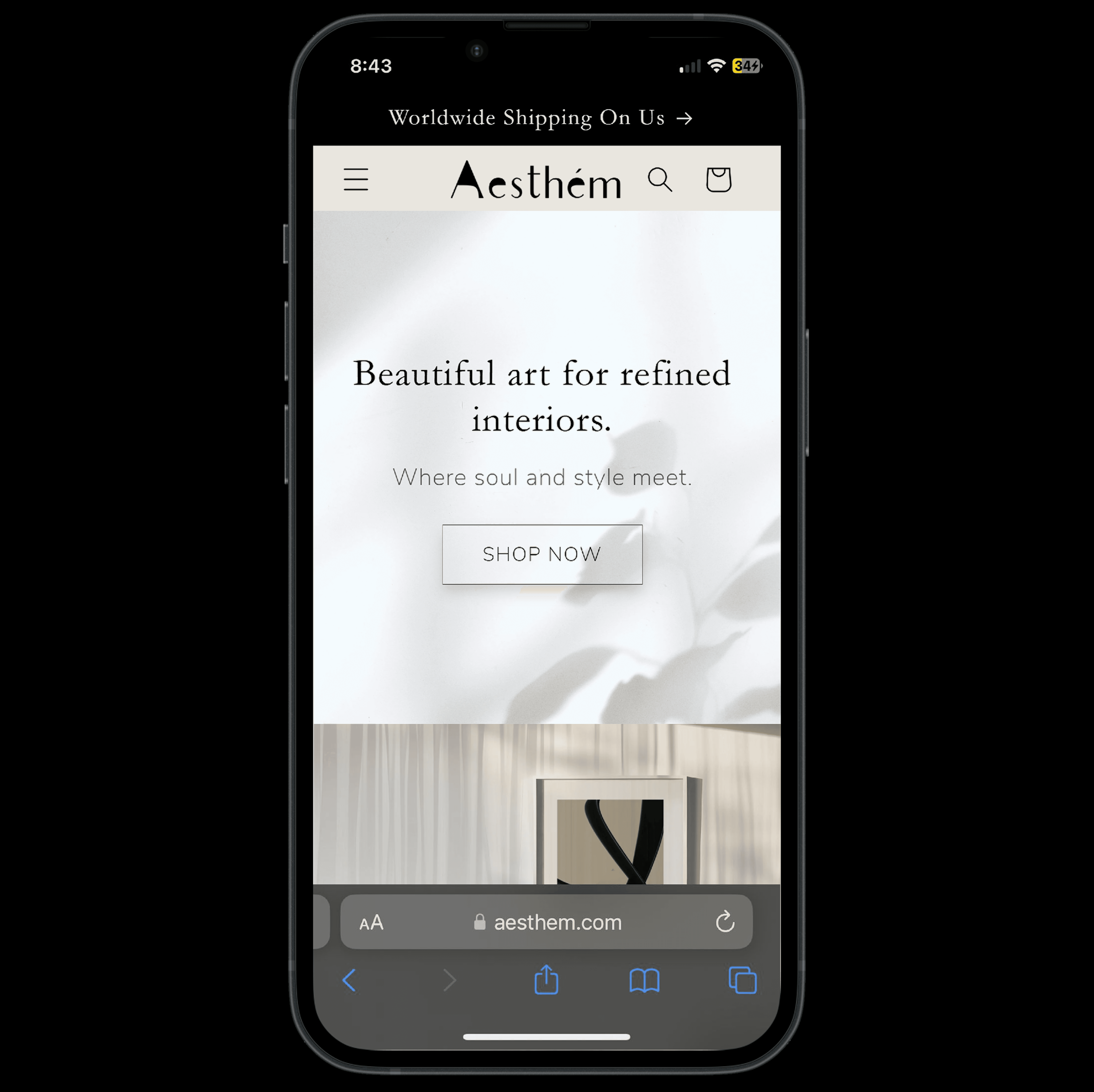
"Complimentary shipping worldwide" → "Worldwide Shipping On Us"
“On Us” taps into loss aversion. It frames shipping as a gift, not a cost. This lowers abandoned cart rates.
So, I offered free shipping + created a high converting CTA.
"Complimentary shipping worldwide" → "Worldwide Shipping On Us"
“On Us” taps into loss aversion. It frames shipping as a gift, not a cost. This lowers abandoned cart rates.
Product Display Page (PDP) Refinements
Product Display Page (PDP) Refinements
The original PDP lacked thoughtful art, clarity, character, and conversion cues.
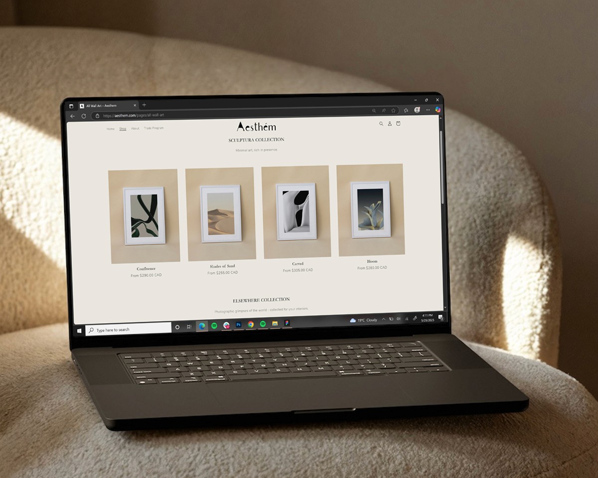
So, I went on a journey to create new art pieces and do travel photography, adding new collections.
New artwork and UX design for new PDP reflects the brand's elevated positioning and justifies the premium price.
This creates a clear destination for soulful, high-end art solving the initial problem.
The original PDP lacked thoughtful art, clarity, character, and conversion cues.
So, I went on a journey to create new art pieces and do travel photography, adding new collections.
New artwork and UX design for new PDP reflects the brand's elevated positioning and justifies the premium price.
This creates a clear destination for soulful, high-end art solving the initial problem.
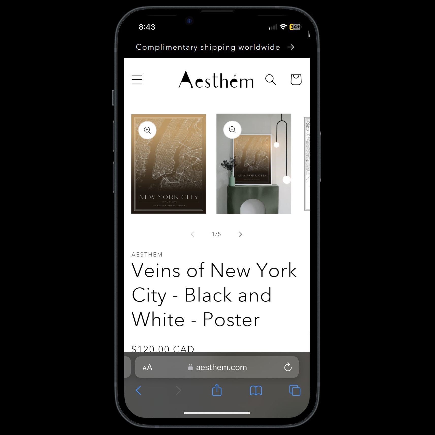
Before
Generic product thumbnails, unclear hierarchy, and copy
with no emotional and converting pull.
Before
Generic product thumbnails, unclear
hierarchy, and copy with no emotional
and converting pull.
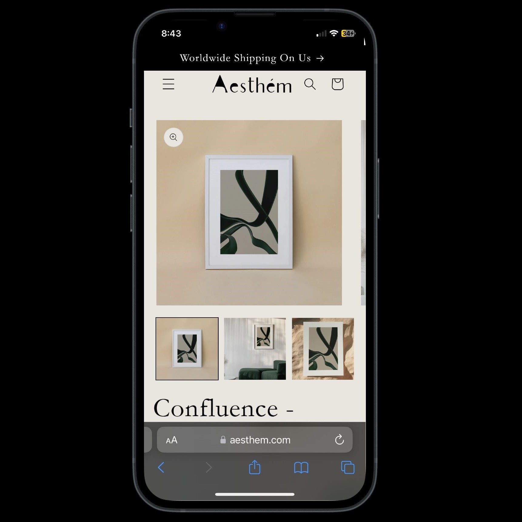
After
Elevated styling, thoughtful artwork, and narrative-rich copy
reframes art as a collectible item. The layout and language speak directly
to a design-conscious customer seeking meaning, not just material.
After
Elevated styling, thoughtful artwork,
and narrative-rich copy reframes art
as a collectible item. The layout
and language speak directly
to a design-conscious customer
seeking meaning, not just material.
Added variant pills and clarified variant
options ("Framed" vs "Print Only") to
reduce decision fatigue. Previous design
had multiple size and finish options which
can overwhelm customers.
Added variant pills and clarified
variant options ("Framed" vs "Print Only")
to reduce decision fatigue. Previous
design had multiple size and
finish options which can
overwhelm customers.
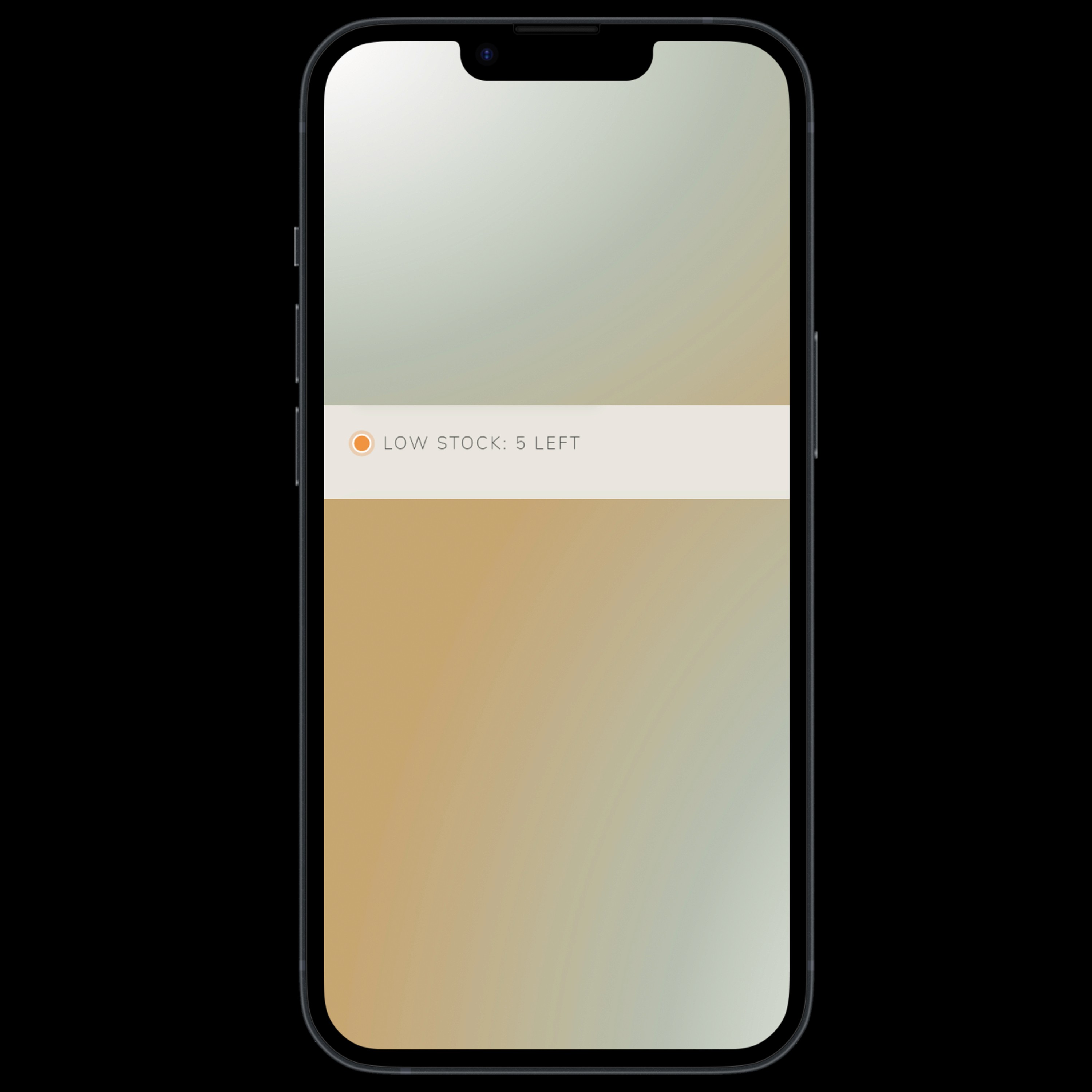
Used Scarcity, a Robert Cialdini persuasion
principle. Added "Low Stock" to create
urgency and triggers fast, intuitive checkout
behavior increasing conversion.
Used Scarcity, a Robert
Cialdini persuasion principle.
Added "Low Stock" to create
urgency and triggers fast,
intuitive checkout behavior
increasing conversion.
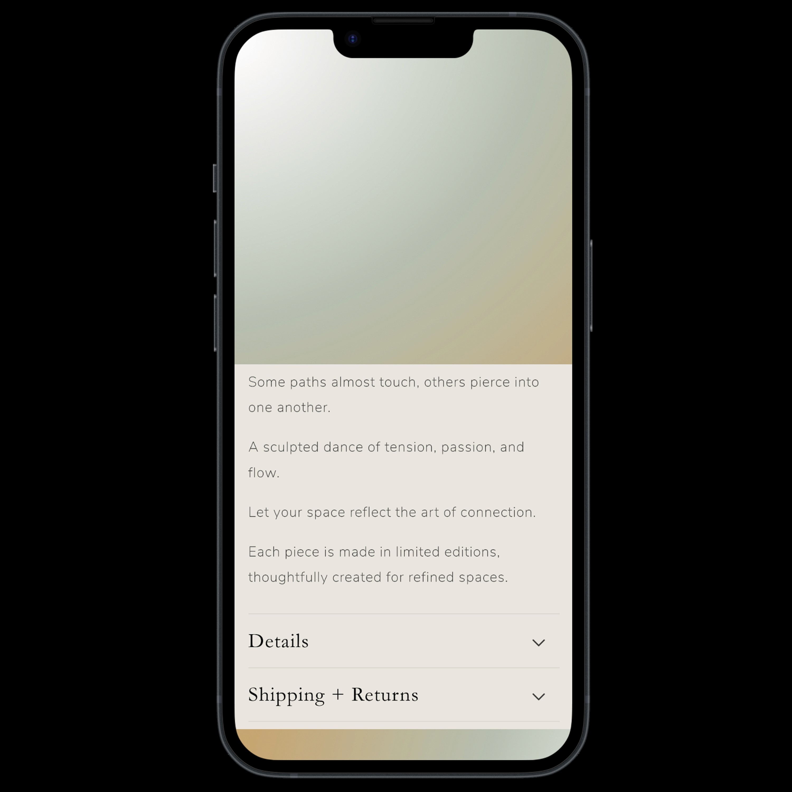
Rewrote the product description into a
rhythmic and poetic narrative while
preserving brand values.
Rewrote the product description
into a rhythmic and poetic
narrative while preserving
brand values.

Used Scarcity, a Robert Cialdini persuasion
principle. Added "Low Stock" to create
urgency and triggers fast, intuitive checkout
behavior increasing conversion
Added variant pills and clarified variant
options ("Framed" vs "Print Only") to reduce
decision fatigue. Previous design had multiple size and
finish options which can overwhelm customers.
Rewrote the product description into a
rhythmic and poetic narrative while
preserving brand values.
USER INTERVIEW
USER INTERVIEW
After early feedback from customers like Muneeb, I simplified shipping and integrated Apple Pay - small changes that reduced friction and improved trust.
After early feedback from customers like Muneeb, I simplified shipping and integrated Apple Pay - small changes that reduced friction and improved trust.
After early feedback from customers like Muneeb, I simplified shipping and integrated Apple Pay - small changes that reduced friction and improved trust.

Multiple payment methods available
2 free shipping options → 1 auto-selected free shipping

WELCOME FLOW
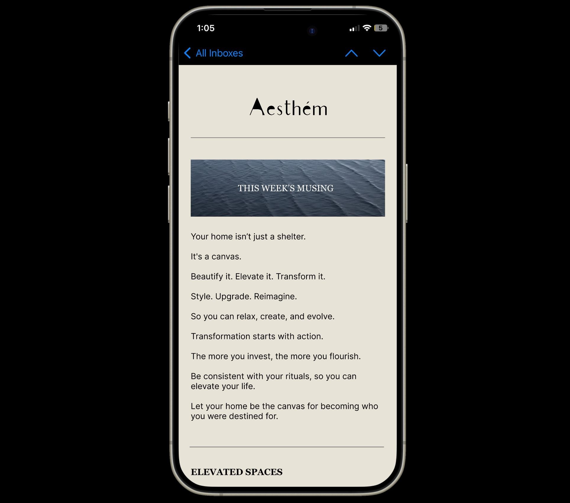
Spanning 48 hours, I crafted a 3-part Welcome Flow in Klaviyo for Aesthem, designed to build trust, brand love, and first purchase intent.
Each email blends storytelling with visuals rooted in strategy.
Spanning 48 hours, I crafted a 3-part Welcome Flow in Klaviyo for Aesthem, designed to build trust, brand love, and first purchase intent.
Each email blends storytelling with visuals rooted in strategy.
Spanning 48 hours, I crafted a 3-part Welcome Flow in Klaviyo for Aesthem, designed to build trust, brand love, and first purchase intent.
Each email blends storytelling with visuals rooted in strategy.
ABANDONDED CART FLOW
Using Klaviyo, I created a system of 4 automated emails to reduce customer churn, recover lost revenue, and build urgency over multiple, personalized touchpoints.
Using Klaviyo, I created a system of 4 automated emails to reduce customer churn, recover lost revenue, and build urgency over multiple, personalized touchpoints.
Using Klaviyo, I created a system of 4 automated emails to reduce customer churn, recover lost revenue, and build urgency over multiple, personalized touchpoints.


AESTHEM WEBSITE
NEXT STEPS
Add Social Proof
Add Social Proof
Add Social Proof
→ Press Mentions
→ Customer Reviews
→ Client Testimonials
→ How Aesthem Art Collectors Styled Their Space
→ Press Mentions
→ Customer Reviews
→ Client Testimonials
→ How Aesthem Art Collectors Styled Their Space
AESTHEM BRANDING

EMAIL CAMPAIGN
Designed on-brand email campaigns using Figma and later uploaded the slice designs on Klaviyo.
Designed on-brand email campaigns using Figma and later uploaded the slice designs on Klaviyo.
Designed on-brand email campaigns using Figma and later uploaded the slice designs on Klaviyo.
NEXT PROJECT
Case Study
Case Study